Sunday, 17 February 2013
Night Goblin WIP_08
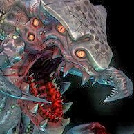
Spending pretty much every minute of my spare time on this lil' dude. Here you'll see some polypainting and continued outfit work. I'm aiming to get a low poly version of him without his robes, hood and accessories complete before I continue with the rest of his outfit. Everything in the first two images is ready to be baked down, except the pants which need some low mesh work. I'm happy with the polypaint but I'm bound to touch it up and add extra detail in Photoshop.
I'll also be creating at least two other weapons (two daggers) and a shield. Ideally I'd like a range of weapons including spears and bows. I've also got various head sculpts planned so I could make a small group of these guys. Alternate shield designs would also be nice but I'll have to see how it goes.. there's just so much to be done!
First and foremost, creating this warlord character is my priority. Variations after (hopefully.) ;)
...Now what would really be awesome is a giant squig for him to ride!.. ...I'm getting carried away again..
Subscribe to:
Post Comments (Atom)


Looking good man! Them pants and accessories are great ;). The polypaint is looking cool!
ReplyDeleteOne thing I would say is to maybe try and get some subtle warmer tones in the fleshier areas of the skin, like the tip of the nose, cheeks and chin. Your bang on with the lighter tones on areas where the skin is closest to the underlying skeleton, the brow bones, ribcage etc.
If your going for a froggish look, then they can sometimes appear to go against this idea because of their camouflage. But even then, you can get a feel for the fleshier tones. Like this wee fellow
http://www.warrenphotographic.co.uk/photography/bigs/05046-Green-Tree-Frog-white-background.jpg
Give it a go and see how it goes man.
But as I said, he's looking sound as he is!
Thanks man! I think it helped a lot. I've just put up a new post, the jpeg doesn't really do it justice but see what you think :) I might do a comparison with different colour intensities. Its just the challenge of making it noticeable but subtle!
ReplyDelete